



Instagram’s new wordmark sparks ‘Instagzam’ debate
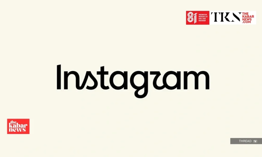
Thekabarnews.com—Instagram has introduced a redesigned wordmark for the first time since 2016. The update gives its familiar handwritten name a cleaner and more contemporary appearance. The...

Summary
- Instagram introduced a redesigned wordmark, shifting to a cleaner and more modern font while keeping its app icon unchanged.
- The update, announced by Adam Mosseri, refines the existing identity rather than being a complete rebrand.
- Critics pointed out legibility issues with the new letter ‘r,’ which led to mixed reactions from users and designers.
- Some praised the blend of cursive and printed forms, while others felt it made the name harder to read.
- Overall, responses ranged from appreciation for modernizing the brand to concerns over familiarity with the updated design.
Thekabarnews.com—Instagram has introduced a redesigned wordmark for the first time since 2016. The update gives its familiar handwritten name a cleaner and more contemporary appearance. The platform’s camera-shaped app icon remains unchanged.
Instagram head Adam Mosseri announced the visual update on Instagram and Threads on Thursday, August 13. The Meta-owned platform described the redesign as a refinement of its existing identity rather than a complete rebrand.
The new wordmark combines simplified printed letterforms with selected cursive details. Mosseri described it as “sharper and more modern,” while emphasizing that the design still refers to Instagram’s original handwritten character.
Instagram redesigned the lettering to make its branding appear clearer, more adaptable and consistent with the platform’s broader visual system.
The company has evolved considerably since adopting its previous script wordmark alongside the gradient camera icon in 2016.
Instagram introduced another major visual refresh in 2022, including its proprietary Instagram Sans typeface and brighter gradient treatments.
The latest change focuses primarily on how the platform’s name appears at the top of the application and in selected branding materials.
Because the camera icon remains unchanged, users should not interpret the new wordmark as a replacement for Instagram’s principal app logo. The update is also not expected to affect account features, feeds, Reels or other core services.
The redesigned letter “r” quickly became the focus of online criticism. Some users said its curved shape resembles a “z,” causing them to read the name as “Instagzam” rather than “Instagram.”
The nickname appeared repeatedly in discussions across design, marketing and Instagram communities.
One Reddit discussion attracted hundreds of comments. Users debated whether the problem was with the letterform itself or with declining familiarity with cursive writing.
Other critics argued that combining printed and cursive forms made the name less legible. This was especially an issue when displayed at a small size.
Several users suggested that connecting or simplifying the final letters could make the wordmark easier to recognize.
It was not an all-negative response. Some designers and users praised the update for maintaining enough of the handwritten personality to be recognizable. They felt it veered away from what they perceived as an increasingly dated script style.
Others called the change a fair “lateral move.” It wasn’t a giant improvement or a major regression. It was a small tweak to bring Instagram’s identity more in line with the current digital design.
That mixed reaction highlights a long-standing challenge for established tech brands. When audiences have spent years associating a certain design with an application they use daily, small changes can elicit strong reactions.






No Comment! Be the first one.