



Pontianak’s 255th anniversary logo puts people first
PONTIANAK, thekabarnews.com—The Pontianak city administration has unveiled a people-centered logo for Pontianak’s 255th anniversary. The new logo shifts the visual focus from familiar landmarks to...

PONTIANAK, thekabarnews.com—The Pontianak city administration has unveiled a people-centered logo for Pontianak’s 255th anniversary. The new logo shifts the visual focus from familiar landmarks to the residents who shape life in the West Kalimantan capital.
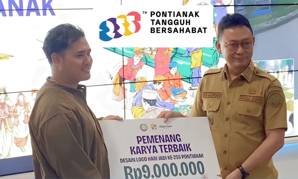
Mayor Edi Rusdi Kamtono launched the logo at Pontive Center in Pontianak City Hall on Monday, Oct. 5. The city will commemorate its anniversary on Oct. 23.
The design carries the theme “Tangguh Bersahabat” [Resilient and Friendly]. Its supporting slogan, “Kite Jage Kite,” uses the local Malay dialect to convey the message that residents should look after one another.
Pontianak residents Gusti Fakhri Aliansyah and Tomy Anggara created the winning design. Unlike previous anniversary logos that commonly featured buildings or other physical symbols, their work presents people as the city’s central identity.
“From the beginning until today, we have developed by adapting and strengthening one another,” Gusti said after the launch, according to the Pontianak city administration.
Gusti said the concept grew from observing how residents responded to environmental and urban challenges. Traditional stilt houses and raised wooden walkways (gertak) demonstrate how communities have adapted to high water levels.
The same collective response becomes visible when smoke from forest and land fires (karhutla) affects the city, he added. The designers therefore portray resilience not as an individual ability to withstand hardship, but as a community’s capacity to adjust and offer mutual support.
“What I want to highlight through this logo is our collective spirit,” Gusti said. “We are resilient because we stand together.”
Edi said the theme emerged from the community’s experience in confronting recurring problems, including haze, prolonged dry seasons and disruptions to Pontianak’s raw-water supply. Saltwater intrusion has also affected the quality of the city’s water sources during dry periods.
Meanwhile, the word “friendly” represents the harmony that Pontianak residents maintain amid the city’s ethnic and religious diversity.
“We need resilience to become the defining spirit of Pontianak’s residents,” Edi said. “At the same time, Pontianak must remain harmonious, tolerant, peaceful, welcoming and comfortable.”
The city administration selected the logo through its Merancang Dua Lima Lima design program. Twenty-nine teams applied before organizers chose 16 to participate in workshops, mentoring sessions and final presentations. Five teams reached the final round.
The city restricted the competition to local talent. Team leaders had to hold a Pontianak identity card. Other members had to live in the city or surrounding area. The policy differed from previous competitions that accepted entries nationally.
“This year, we want Pontianak residents to create the city’s branding,” Youth, Sports and Tourism Agency head Rizal said during the workshop. The city government said the approach sought to keep the design closely connected to Pontianak’s identity.
Gusti and Tomy completed their design in approximately two weeks. They said developing the central concept and finding a visual form that communicated its meaning presented the greatest challenges.
Pontianak will use the logo throughout its anniversary events. As the city marks 255 years, the administration hopes Pontianak will continue to progress through the creativity, solidarity and active participation of its residents.


No Comment! Be the first one.